Nano Banana 2.1 Google's newest image model is live. Make pictures from text or edit with up to 14 photos.
Try itAI Art · November 3, 2024 · Updated August 26, 2026 · 11 min read · 3352 views
AI Logo Design Prompts and Tips: 2026 Guide
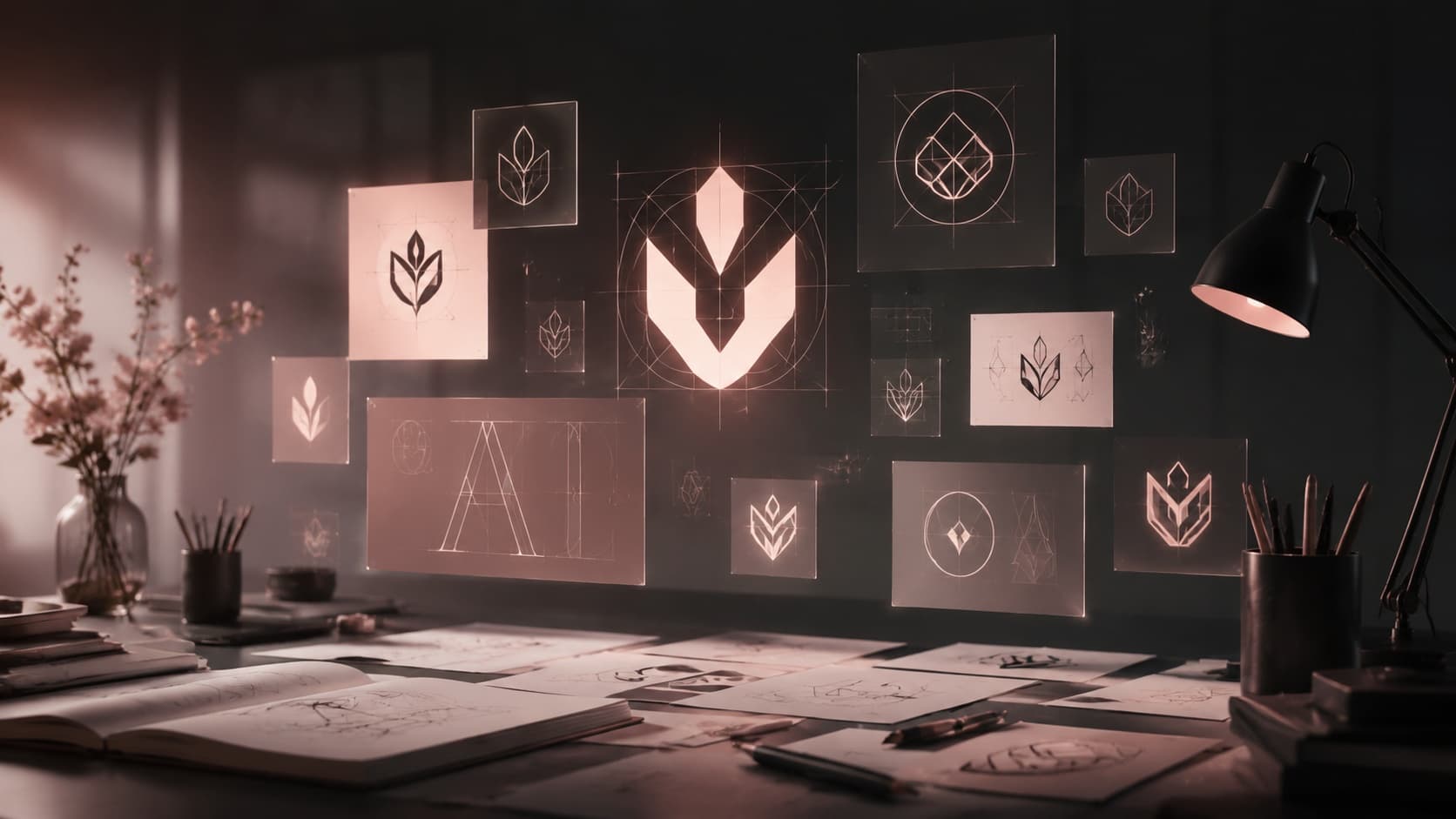
Why AI still struggles with logo text, which models handle it well, the decisions that matter most, and the raster versus vector problem most guides skip.
Flux AI Image Generator
Try the Flux image models on Enhance AI.
Ask any image model for a logo and you will eventually get one back with a brand name that is almost right. A letter doubled, a letter missing, a word that reads correctly at a glance and falls apart the moment you actually spell it out. Of everything AI image generators struggle with, legible text is one of the hardest, and logos are the one design task where that weakness is impossible to hide.
This guide covers why text specifically breaks down, which current models actually handle it well, the decisions that make the biggest difference before you write a prompt, and the one detail almost no prompt list mentions: the file you get back is not the file a real logo needs to be.
Why text is uniquely hard for an image model
Most of what an image model generates, faces, landscapes, objects, is interpretive. There is no single correct cloud or tree, so the model can be loosely right and still succeed. Text is the opposite. It is exact and rule bound, and a single wrong letter does not make it slightly off, it makes it wrong.
Diffusion models process an image as a grid of small visual patches, tiles of pixels that carry texture and shape information but no concept of an individual character. The model has learned what text generally looks like as a visual pattern, rows of small repeating shapes with certain spacing and rhythm, without learning what the specific shapes have to be to spell a specific word. On top of that, the photos most models trained on rarely came with an exact transcription of any text they contained. A caption describes a sign in a street photo, it does not spell out what the sign says letter by letter, so the model had far less signal to learn precise spelling from than it had to learn what a face or a chair looks like.
This is also why logos are harder than most text in an image. A logo usually asks for text integrated into a shape, wrapped around a badge, bent along a curve, mixed with an icon, which adds a layout problem on top of the spelling problem.
Which models actually handle this well
The good news is that this is one of the areas where model choice matters more than prompt wording. Some current models are specifically strong at rendering short, clean text, and the gap between a text capable model and a general purpose one is large enough that switching models solves more of this problem than rewriting a prompt five times on the wrong one.
GPT Image 2 is a strong choice for a logo that includes a brand name, since it handles short, deliberate text passages more reliably than most general purpose models. Seedream renders fine detail and typography cleanly and holds up well if you need the result at a higher resolution. Recraft V4 deserves particular attention for logo work specifically, since it is built around clean, design grade output and, unlike almost every other model, can output the result as an actual vector file rather than a flat image, which matters more than it sounds like it should, for reasons covered below.
None of this means older or more general models cannot produce a usable logo concept. It means that if legible, correctly spelled text is the actual point of the image, starting with a model built for that job saves several rounds of frustration.
Six decisions to make before you write the prompt
Most disappointing logo results trace back to a decision that got left to the model instead of made on purpose.
Decide the logo type first. An icon only mark, a wordmark that is just styled text, a combination mark that pairs an icon with the name, a badge or emblem, a monogram, or a mascot are genuinely different design problems, and a prompt that does not specify which one lets the model guess, usually into a combination mark whether you wanted one or not.
Be specific instead of using words that mean something different to everyone. Modern, clean, and bold describe a feeling, not a design. Minimalist line weight, geometric shapes, a two color palette, and a specific typographic style say the same thing in a way the model can actually act on.
Keep any text in the prompt short. A one or two word brand name renders correctly far more often than a tagline or a full sentence, since every additional character is another chance for the model to drop or duplicate one.
State plainly that the text should be spelled correctly. It sounds redundant to say, but including a direct instruction to spell the name correctly measurably helps on models that support it, since it pushes the generation toward treating the text as fixed rather than decorative.
Plan on generating more than once. Even on a strong model, the difference between a usable result and a slightly wrong one is often the third attempt, not the first, so budget for a few passes rather than judging a model on a single try.
Reference a real design tradition if you have one in mind. Naming an actual design style, geometric modernist, art deco, Swiss minimalist, gives the model a concrete visual language to draw from instead of an abstract mood.
A concrete comparison makes the difference easier to apply. "A modern logo for a coffee shop" leaves every real decision, the type, the shapes, the palette, the mood, entirely up to the model, and three attempts at that prompt can come back looking like three unrelated brands. "A wordmark logo for a coffee shop called Hearth, geometric sans serif lettering, a single warm brown color, a small line icon of a flame integrated into the H, correctly spelled" gives the model an actual design brief, and results become far more consistent from one generation to the next.
Fewer colors, not more
Real logos overwhelmingly use one to three colors, and there is a practical reason beyond aesthetics: a mark has to work in a single color for embossing, engraving, or a black and white print, long before it works in full color on a website. A prompt that asks for a wide, undefined color range tends to produce something that looks more like an illustration than a mark, since the model has no reason to restrain itself. Naming a specific one or two color combination, rather than leaving color open, both matches how real logos actually get used and gives the model a far narrower, more achievable target.
What actually goes wrong, and what it looks like
A few failure patterns show up specifically in AI generated logo text. Extra or missing letters are the most common, a name that is one character too long or short. Mirrored or backward letters happen because the model has learned the general silhouette of a letterform without a hard rule about its orientation. Invented pseudo letters, shapes that read as text at a glance but are not actual characters, tend to show up when a prompt asks for more text than the model can reliably hold together. Inconsistent weight or style between letters, where half a word looks like one font and half looks like another, comes from the model blending different learned text patterns rather than committing to one. Text warped to fit a curve or badge shape can also distort individual letters past the point of being legible, even when the same text would have rendered fine in a straight line.
The part most guides skip: raster versus vector
This is the detail that matters most once you actually need to use a logo, not just look at one. Every AI image model, including the ones good at text, outputs a flat raster image, a fixed grid of pixels. A real logo needs to work as a vector, built from mathematical paths rather than pixels, so it can be scaled from a favicon to a billboard without losing a single sharp edge. A raster logo enlarged past its native resolution turns soft and pixelated, which is a real problem the moment you need it printed large or placed on merchandise.
This is exactly what Recraft V4 solves directly. Alongside standard image generation, it can output true vector files, so a logo made with it is not just a picture of a logo, it is an editable vector asset from the start. If you generate a logo concept on a different model, the practical path is to treat that output as a concept to trace or rebuild in a vector tool afterward, not as a finished, infinitely scalable asset on its own.
Fixing one wrong letter without starting over
For most AI image fixes, masking just the broken part and regenerating only that area works well, and we cover that approach in detail in our guide to fixing common generation problems. Text is the one case where that technique is less reliable than usual. A single letter has to match the weight, spacing, and style of every letter around it exactly, and asking a model to regenerate one character while blending seamlessly into its neighbors is a harder ask than fixing an isolated object like a hand or a background.
It is still worth trying for a small, contained fix, mask just the wrong letter and describe exactly what it should be. But when several letters are off, or the whole word feels inconsistent, it is usually faster to simplify the text you are asking for, switch to a model built specifically for text, or generate the mark and the wordmark separately so you can pair a strong icon with cleanly set type rather than asking one generation to get both exactly right at once.
A short checklist before you generate
Have you decided the logo type instead of leaving it to the model. Is the brand name genuinely short, ideally one or two words. Have you told the model directly that the text should be spelled correctly. Are you using a model actually built for text, especially if the whole point of the image is the wordmark. Do you have a plan for turning the result into a usable file, whether that is generating directly as a vector or treating the output as a concept to rebuild.
Frequently asked questions
Why does AI keep misspelling text in logos?
Image models learn text as a visual pattern, rows of shapes with a certain rhythm, rather than as an exact sequence of specific characters, and the training photos they learned from rarely came with an exact transcription of any text they contained. Short, simple text renders far more reliably than long text for this reason.
Which AI model is best for a logo with text?
GPT Image 2 and Seedream both handle short, deliberate text passages more reliably than general purpose models, and Recraft V4 is worth using specifically for logo work since it can output the result as an actual vector file rather than a flat image.
Can I fix just one wrong letter instead of regenerating the whole logo?
You can try masking just that letter and describing the correct one, but text is less forgiving to patch than most fixes since every letter has to match the weight and spacing of its neighbors exactly. If several letters are off, simplifying the text or switching models is usually faster than repeated small fixes.
Is an AI generated logo ready to use right away?
Only if it was generated as a vector. Most AI image output is a flat raster image, which will look soft if enlarged far beyond its original size. A real logo needs to work as a vector so it scales cleanly from a small icon to a large print, which is why a model like Recraft V4, built to output real vectors, matters for finished logo work rather than just a first concept.
How much detail should I put in a logo prompt?
Enough to remove the guesswork. Name the logo type directly, describe the actual visual choices, line weight, shape, palette, style, rather than a mood word like modern, and keep any text short. Vague prompts get filled in with the model's own default assumptions, which rarely match what you pictured.
Try it yourself
A strong AI generated logo comes from picking a model built for text, being specific about the actual design decisions instead of leaving them to chance, and knowing whether you need a vector file or just a concept. Open the editor to generate with a text capable model, or head to Vector AI to create a logo as a real, scalable vector file from the start.

Written by Kushal
Kushal builds Enhance AI and writes the technical guides, from model merging and fine tuning workflows to prompting technique and how the platform's tools work under the hood. Every prompt in his articles is run on the platform before it is published, and the failure cases he writes about are ones he actually hit.
Related Articles
All Articles
Ready to Create with AI?
Transform your ideas into stunning visuals with Enhance AI. Image generation, video creation, upscaling, and more.