AI Art · December 6, 2024 · Updated July 12, 2026 · 15 min read · 5687 views
What Actually Makes an AI Image Look Photorealistic
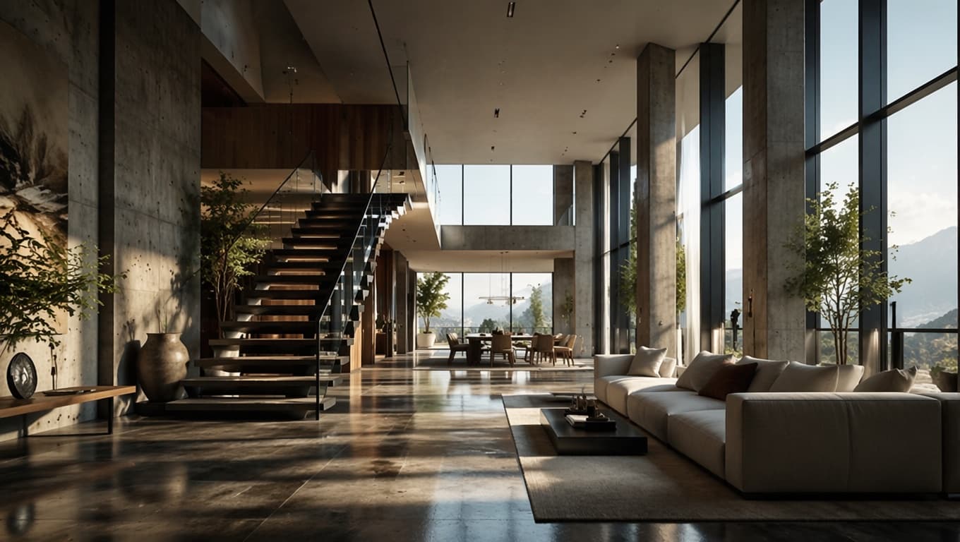
Why AI images look good at a glance but read as fake up close, and the specific prompt language that fixes it across any subject.
You generate an image, glance at the thumbnail, and think it looks great. Then you open it full size and something is off. Maybe the shadow under a chair falls in a direction the window light does not support. Maybe the marble countertop has a grain pattern that repeats every eighteen inches like wallpaper. Maybe a face is symmetrical in a way no real face ever quite is. Nothing is dramatically wrong, and that is exactly the problem. Photorealism does not fail loudly. It fails in the details you only notice on the second look, and once you notice one, you cannot stop noticing the rest.
This happens across every subject, not just portraits. Product renders get a plastic sheen that no real material has. Architectural visualizations get lighting that looks correct until you check whether the sun direction matches the shadow direction. Landscapes get a saturation and clarity that no camera sensor or human eye actually produces outdoors. Still life scenes get objects that sit in a space but do not seem to belong to it, like they were cut out and pasted in, even though nothing was literally cut and pasted.
The good news is that this is mostly a vocabulary problem, not a model limitation. Flux and the other models on Enhance AI are capable of genuinely convincing photorealistic output. What usually goes wrong is the prompt itself. Someone writes "realistic photo of a modern kitchen, high quality, detailed" and expects the model to fill in every decision a real photographer, architect, or product photographer would normally make on purpose. The model does fill in those blanks, but it fills them with its statistical average of every kitchen photo it has ever seen, which is a kind of bland, over lit, slightly plastic non place. Nobody photographs a kitchen like that. Get specific enough about how a photograph is actually made, and the output stops looking like an average and starts looking like a photograph.
Why "realistic" and "high quality" do almost nothing
These two phrases show up in an enormous share of prompts, and they carry almost no information the model can act on. "Realistic" does not tell the model what lens was used, where the light is coming from, what time of day it is, or what the surface materials actually are. It is a vague request for a vibe rather than an instruction. Same with "high quality" and "detailed," which mostly just nudge the model toward more visual noise and sharper edges rather than anything that reads as photographic.
Compare that to a phrase like "shot on a 50mm lens at f/2.8, soft overcast daylight coming through a window camera left, brushed aluminum surface with visible fine scratching." That sentence does not use the word realistic once, and it will produce a far more convincing photograph than a prompt that uses the word realistic five times. The model has plenty of training data that pairs those specific technical and physical descriptions with actual photographs, because that is the language real photographers, cinematographers, and architects use when they describe their own work. Vague adjectives do not map to anything concrete in that training data, so the model has nowhere reliable to go with them.
The fix is to replace adjectives with references. Instead of "beautiful lighting," name the actual light source and time of day: late afternoon sun low on the horizon, coming through sheer curtains, or a single overhead softbox at a 45 degree angle. Instead of "realistic material," name the actual material and its condition: weathered oak with visible grain and a few scratches, not "wood." Instead of "high quality architecture," name the actual architectural style and material palette: mid century modern with board formed concrete, floor to ceiling glass, and blackened steel window frames. A specific reference gives the model something concrete to reconstruct. A vague adjective gives it nothing but permission to guess.
Camera and lens language that actually does work
The single highest leverage addition to a photorealism prompt is honest camera and lens vocabulary, because this is language lifted directly from how photographers describe their own gear and technique, and there is a huge volume of real photography discussed in exactly these terms.
Focal length changes more than most people expect. A 24mm or 35mm lens compresses less and includes more of the surrounding environment, which reads as documentary or architectural. An 85mm or 100mm lens compresses the background and produces the shallow, separated look associated with portraits and product close ups. Naming the focal length is a fast way to tell the model what kind of photograph this is supposed to be, before it has even considered the subject.
Aperture matters just as much. An f/1.4 or f/1.8 aperture produces a narrow plane of focus with a soft, blurred background, the classic look of a dedicated portrait or macro shot. An f/8 or f/11 aperture keeps almost everything sharp front to back, which is what you want for architectural or landscape work where the whole scene needs to read clearly. If a prompt does not specify one or the other, the model tends to default to a shallow, hazy middle ground that looks vaguely photographic but not like any specific real photograph.
Shot type and camera position round this out. Eye level, three quarter view, low angle looking up, top down flat lay, these all describe a real physical choice a photographer or architect makes before pressing the shutter. Naming the choice pins the composition down instead of leaving it to chance.
None of this vocabulary is exclusive to any one subject. The same language that makes a cinematic portrait convincing, lens choice, aperture, light quality, is exactly what this guide on lens, lighting, and color grading vocabulary walks through in more depth, and it applies just as well to a still life or a building exterior as it does to a person.
Lighting has to behave like actual light
Lighting is where photorealism gets won or lost, because human vision is extremely tuned to catching lighting that does not make physical sense, even when we cannot immediately say why something looks wrong.
Real light comes from somewhere specific, and it behaves consistently once it gets there. Say where the light source is and what kind of light it is: golden hour sun low on the horizon and slightly behind the subject, overcast daylight producing soft even shadows with no hard edges, a single window to the left casting a directional falloff across the room, a practical lamp on a side table adding warm fill in one corner. Once you tell the model where the light originates, every surface in the scene has a reason to be lit the way it is, and shadows have a reason to fall where they fall.
This matters enormously for architectural and product work specifically. An architectural render needs its shadows to agree with its stated time of day. Late afternoon light produces long, warm, low angle shadows. Midday light produces short, harsh, nearly vertical shadows and much cooler color. If a prompt says "sunset" but does not carry that lighting logic through the rest of the description, the model may still put highlights and shadows in places that do not agree with a low sun, and that mismatch is one of the fastest ways a render gets flagged as artificial, even by someone who could not tell you exactly why.
Naming a light quality also helps: hard direct light producing crisp defined shadow edges, versus soft diffused light producing a gradual, soft edged shadow. Overcast skies produce the second kind almost everywhere outdoors, and a lot of unconvincing outdoor renders happen because the prompt asked for sunny weather while describing lighting that only makes sense on a cloudy day, or vice versa.
Material and texture specificity, subject by subject
Materials are where genuinely specific language pays off the most, because "realistic" applied to a material means nothing, while a named material with a named condition means everything.
For product renders, name the actual material and its surface condition rather than a generic category. "Metal" could be anything. "Brushed stainless steel with fine directional scratching that catches the light" is something the model can actually reproduce, because that phrase describes a real, physically consistent surface. The same goes for fabric: not "cloth" but "heavyweight cotton canvas with visible woven texture and slight creasing," which gives the model a texture to render rather than a flat color to fill in.
For architectural and interior work, name the finish, not just the material category. Concrete can be board formed with visible timber grain, or polished and reflective, or exposed aggregate, and each one produces a completely different surface under the same light. Wood can be white oak with a matte oil finish, or dark walnut with a high gloss lacquer, and naming which one you mean removes an enormous amount of guesswork. The same logic applies to stone, glass, plaster, and metal trim throughout a scene.
For landscapes and outdoor scenes, specificity shows up as named weather and named terrain rather than adjectives. "Beautiful nature" tells the model nothing. "Overcast sky over a pine forest with damp moss covered rocks and mist low in the valley" gives it an actual place with actual physical conditions. Naming a real season, a real time of day, and a real weather condition together does more for believability than any number of quality adjectives stacked on top of each other.
For still life and studio setups, texture specificity often means naming the small imperfections a real object would have: a ceramic bowl with a faint glaze variation near the rim, a piece of fruit with a slightly uneven skin tone, a ceramic mug with a hairline crazing pattern in the glaze. Real objects are not perfectly uniform, and naming a small, plausible imperfection reads as far more convincing than describing the object as flawless.
A concrete before and after
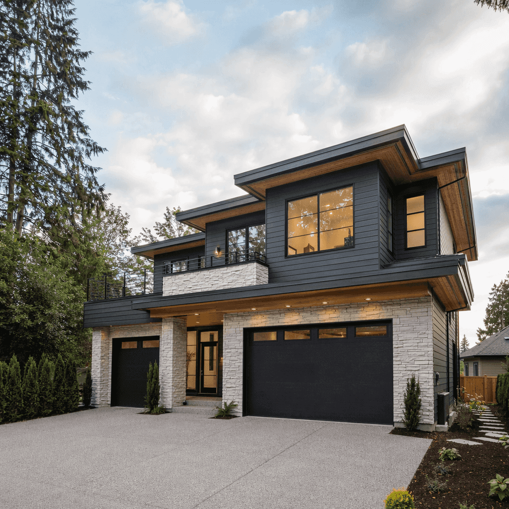
Here is the difference in practice. A vague prompt: "realistic photo of a modern house, high quality, detailed, professional." That sentence gives the model almost nothing to work with beyond subject matter, so it will produce something that looks like a house, rendered in whatever the model's default photographic style happens to be, which tends to look pleasant and completely generic.
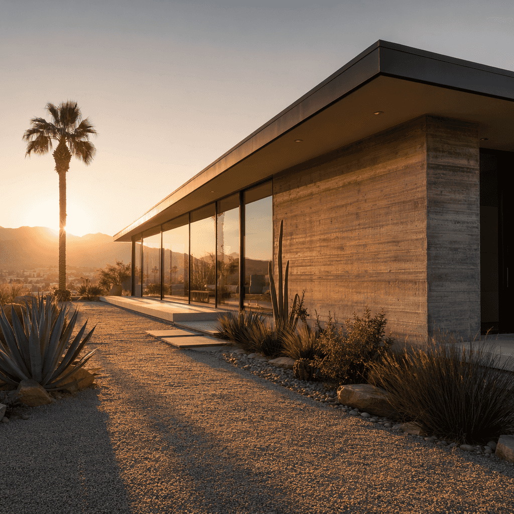
A specific prompt aimed at the same subject: "Mid century modern single story house at golden hour, low sun behind the structure casting long warm shadows across a gravel path, board formed concrete facade with visible wood grain texture, floor to ceiling glass panels reflecting the sky, blackened steel window frames, shot on a 24mm lens at f/8 from a low three quarter angle, slight haze in the air from the low sun."
Nothing in that second prompt asks for realism directly. It does not need to, because every phrase in it describes a decision a real architectural photographer would actually make: the time of day, the lens, the aperture, the materials, the angle. The model has an enormous amount of real architectural photography to draw on that uses exactly this kind of language, so it has somewhere concrete to go instead of falling back on an average.
The subtle tells that break the illusion even in a good image
Even a well built prompt sometimes produces an image that is 95 percent convincing with one detail that gives it away. Knowing what to check for saves time, because these tells are predictable and repeat across generations.
Materials that behave wrong for their category are one of the most common. A material that looks metallic but reflects light like plastic, or a fabric that folds like it has no weight to it, breaks the illusion even when everything else in the frame is solid. Lighting that does not match across the scene is another, a shadow falling one direction on one object and a different direction on another object a few feet away, or a reflection that shows a light source the rest of the image does not support. Textures that repeat in an obviously tiled pattern show up often on large surfaces like tile floors, brick walls, or grass, where a repeating unit becomes visible if you look for it, something no real surface actually does because real surfaces have natural variation. Perfect symmetry is another giveaway, whether in a face, a building facade, or an arrangement of objects, because real world subjects are almost never perfectly symmetrical and an image that is can read as artificial even when nothing else is wrong.
Hands, teeth, and small background text remain the areas most likely to fail outright rather than subtly, so it is worth checking those first on anything with a person or a sign in frame.
None of these problems mean a prompt has to be thrown out and started over. Most of the time the rest of the image is fine and only one region needs a fix. The image editor has a Change Region tool built exactly for this, letting you mask just the part of the image that broke the illusion, whether that is a hand, a shadow that fell the wrong way, or a tiled looking texture, and regenerate only that area while leaving the rest of the image untouched. If something in the frame just should not be there at all, a stray object or an extra reflection, the Magic Eraser tool removes it cleanly rather than forcing a full regeneration. And for anything that needs a broader adjustment across the image, the AI Edit tool takes a plain language instruction and applies it directly.
A working checklist before you generate
Run through this before hitting generate, especially on anything meant to look like a real photograph rather than an illustration.
Does the prompt name an actual lens and aperture, rather than leaving focus and depth to chance. Does it name a specific light source and time of day, and does that light source logically explain the shadows the scene should have. Does every major material have an actual name and condition, not just a category like wood or metal. Does the prompt avoid empty adjectives like realistic, high quality, and detailed in favor of concrete, checkable details. Is there a specific setting named, a real place, weather condition, or architectural style, rather than a generic backdrop. And after generating, does a full size look at the image turn up any repeating textures, mismatched shadows, or too perfect symmetry that a quick regional fix could clean up.
FAQ
What is the fastest way to make an AI image look less like an illustration and more like a photograph?
Add real camera and lens language: a focal length, an aperture, and a named light source. These three details alone push a model away from a painterly or illustrated interpretation and toward something that reads as photographed, because that is the language actual photography is described in.
Why does adding the word "realistic" to a prompt not seem to help much?
Because it is not a specific instruction. It tells the model you want a vibe, not what decisions to make about lens, light, or material. Naming an actual lens, light source, or material gives the model something concrete to reconstruct, where the word realistic on its own gives it nothing to act on.
Does this approach work for landscapes and product shots, or only portraits?
It applies across all of them. A landscape needs named weather, terrain, and time of day just as much as a portrait needs a named lens and light source. An architectural render needs named materials and a light source that matches its stated time of day. The underlying principle, specificity over adjectives, is the same regardless of subject.
My image looks great except for one small detail that gives it away. Do I need to regenerate the whole thing?
Not usually. If one region is the problem, a shadow falling wrong, a texture that tiles, an object that should not be there, the Change Region and Magic Eraser tools in the image editor let you fix just that area without touching the rest of the image or losing everything else that already worked.
Which models on Enhance AI are good for this kind of photorealistic work?
The Flux model family is a strong choice for photorealism generally, and Seedream, Nano Banana 2, GPT Image 2, Qwen Image 2, and Recraft V4 are all available on Enhance AI and each bring their own strengths depending on the subject. Testing the same detailed prompt across a couple of models is a reasonable way to see which one handles a particular material or lighting setup best for your case.
My generation keeps coming out with the wrong lighting or a strange artifact no matter what I try. What should I check first?
That usually points to a specific, fixable cause rather than a broken prompt. The troubleshooting guide walks through the common causes behind generations that come out wrong, including timing based issues and how to tell a rejected prompt from an actual render failure, and the fastest fix for each.
Photorealism is not a setting you turn on. It is the sum of a lot of small, specific decisions, a named lens, a named light source, a named material, stacked into one prompt instead of left to an average. Once you start writing prompts the way a photographer or an architect would actually describe their own work, the gap between an image that looks good at a glance and one that holds up under a closer look starts to close. If you want to try this out, the image editor on Enhance AI gives you Flux and the rest of the models above with free credits to start, no card required.

Written by Vimal
Vimal builds Enhance AI and writes the deep guides on image models and prompting technique. Every prompt in his articles is run on the platform before it is published, and the failure cases he writes about are ones he actually hit.
Related Articles
All Articles


Ready to Create with AI?
Transform your ideas into stunning visuals with Enhance AI. Image generation, video creation, upscaling, and more.