Nano Banana 2.1 Google's newest image model is live. Make pictures from text or edit with up to 14 photos.
Try itAI Art · November 29, 2024 · Updated August 24, 2026 · 16 min read · 3198 views
Digital Surrealism: The Style AI Art Actually Nails
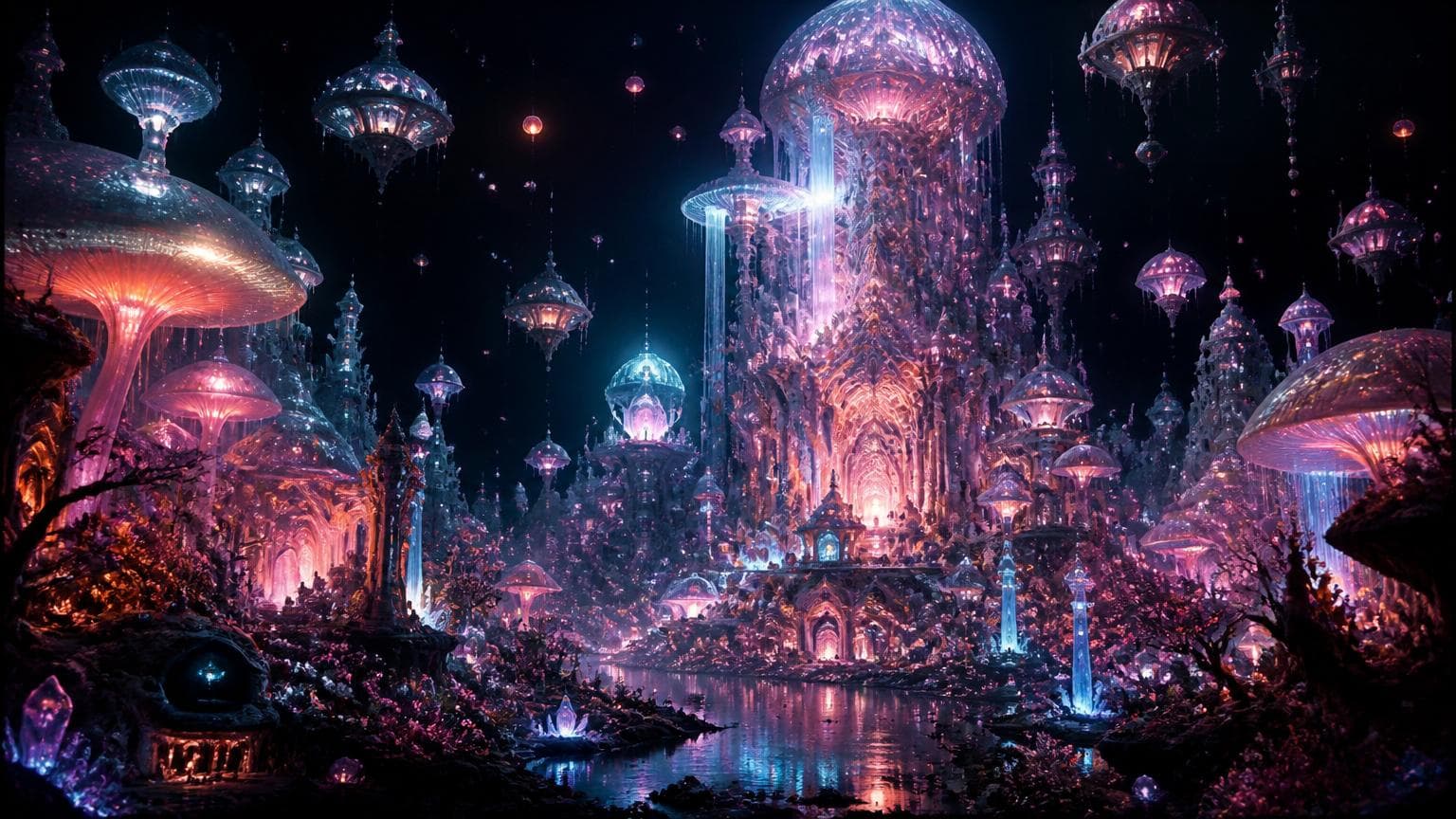
What people call AI influenced art is really digital surrealism. Here's the real style, why AI is good at it, and prompts that work.
Flux AI Image Generator
Try the Flux image models on Enhance AI.
If you search for "AI influenced art," you will not find a real definition, because it is not a real term. It is a phrase that ended up in a batch of prompt guides a while back, probably as an awkward stand in for something that does have an actual name once you look at what those guides were actually showing: caverns lit by glowing fungi, cities carved from ice under aurora skies, oceans that reflect entire galaxies, gardens growing under alien constellations. That specific look, dense, dreamlike, physically impossible but rendered with total conviction, already had a name long before AI image models existed. It is called digital surrealism, and when it leans more toward creatures, architecture, and world building rather than pure dream logic, people in game and film production circles usually call it maximalist fantasy concept art. Neither term is something being coined here. Both have real histories, and understanding what they actually describe will get you further than chasing a phrase that never meant anything to begin with.
This matters for a practical reason, not just an accuracy one. Search for "AI influenced art prompts" and you mostly get generic filler, because nobody who actually knows how to produce this look uses that phrase. Search or think in terms of digital surrealism, maximalist fantasy scenes, or the specific techniques below, and you start finding, and writing, prompts that actually work.
The real style hiding behind a made up phrase
Digital surrealism draws directly from Surrealism as an art movement, the one associated with Salvador Dali, Rene Magritte, and a handful of other painters who spent the early twentieth century rendering dream logic with total technical control. Melting clocks. A man's face obscured by a floating apple. A train emerging from a fireplace. The point was never confusion, it was total commitment to an impossible image, painted as convincingly as a landscape. That same instinct, take something that could not exist and render it as though it obviously does, is exactly what is happening in a prompt describing a phoenix rising from ash with wings that form sacred geometry, or an underwater city inside glass domes lit by bioluminescent fish.
The maximalist end of this look overlaps heavily with fantasy and science fiction concept art, the kind of work produced for games and film for decades: splash art for a trading card, a loading screen for an open world game, a matte painting built for a movie that was never going to build the set for real. That world has its own working vocabulary, words like ethereal, celestial, otherworldly, and epic scale, and it is worth borrowing directly rather than reinventing.
A few adjacent aesthetics are honest to mention too, since some of the prompts people actually write land closer to one of these than to pure surrealism. Solarpunk describes nature and clean technology merging into the same image, glowing plant life beside advanced architecture, which is close to a neon jungle where vines carry light instead of just growing. Biopunk covers organic material fused with mechanical or technological structure, relevant to anything blending insects, tissue, or growth with machinery. Pop surrealism, sometimes called lowbrow art, mixes whimsical and slightly grotesque imagery inside a surreal frame, and shows up in some of the more playful, cartoonish maximalist prompts. None of these labels are interchangeable, and a single image often sits across two of them at once, but each is a real term with a real definition, unlike the phrase this kind of post used to be built around.
Why diffusion models are particularly good at this look
There is a reason this specific style became so associated with AI generated images in the first place, and it is not an accident of taste. It comes down to how these models actually work, and it breaks into a few separate reasons.
The models that generate these images do not build a scene the way a photo editor would, by cutting and pasting reference material together. They learned a continuous space where every point corresponds to a visual concept, and generating an image means moving through that space toward a description. That is why a model can put grown fungi, cut crystal, and a floating translucent creature into the same frame, with consistent scale and material behavior, despite never having seen that exact combination during training. It is not assembling parts, it is finding a coherent point that satisfies every concept in the prompt at once, which is precisely what makes an impossible combination read as a single, unified place rather than a collage.
Lighting works the same way, learned rather than calculated. A traditional renderer needs an actual light source placed in a scene, with bounce and shadow computed from real geometry. A diffusion model instead learned, from an enormous number of real photographs and paintings, what plausible illumination tends to look like: how light of a given color bounces off wet stone, how a bright object nearby affects nearby shadow color, how mist scatters a glow. Apply that learned behavior to a cavern lit by fungi that do not exist, and the model still produces globally consistent lighting, shadows falling the right direction, color bouncing convincingly across the whole frame, without ever rendering anything physically. That is genuinely difficult to do by hand at speed, since a human illustrator has to reason out every one of those relationships deliberately, one surface at a time.
Then there is the more practical reason, the one that actually explains why these scenes look so dense. A digital painter adding fine carving detail to every surface of an ice palace, texture to every mushroom cap in a cavern, individual scales on a phoenix's wing, is spending time linearly. More detail means more hours, full stop. A diffusion model spends roughly the same amount of computation whether the prompt asks for a plain wall or an intricately carved one. Density of detail across a whole frame, the thing that makes these images feel so maximalist, is nearly free within a single generation. That is the actual mechanical reason this look, cavernous, overloaded, richly textured everywhere at once, shows up so often in AI output. It costs the model almost nothing extra to render, while it would cost a human artist enormously more time.
It is worth adding honestly that some of what people call "the AI look" is not purely a result of prompting either. Models trained on huge, varied datasets tend to default toward a certain visual richness unless a prompt actively pulls them toward photographic restraint, an effect that has been discussed for years across AI art communities. Current models respond more literally to detailed prompts than earlier ones did, but the underlying tendency, toward density and drama when a prompt leaves room for it, is still there in the background.
One prompt, two very different results
Here is the difference a specific prompt makes, using one scene as an example.
A vague version: "A glowing cave with mushrooms, fantasy art."
That will produce something. It will probably not produce anything memorable, because the model has to invent every decision you did not make: what color the glow is, what the cave walls look like, whether there is water anywhere, what the overall mood is supposed to be. Every one of those gaps gets filled with the most generic, statistically average answer the model has on hand.
A specific version, describing the same idea: "An underground cavern carved from wet black stone, its ceiling and walls covered in clusters of bioluminescent fungi glowing cyan and violet. Their light catches on veins of crystal embedded in the rock, scattering into faint color across a still, mirror flat lake at the center of the cavern. Thin mist sits at knee height over the water. Wide framing, shallow depth of field on the nearest fungi cluster, volumetric light through the mist, hyperdetailed texture on the wet stone and crystal, digital painting."
Notice what changed and why each piece matters. "Wet black stone" gives the model an actual material to render, instead of a generic gray cave wall. Naming the exact colors the fungi glow removes a decision the model would otherwise make for you, often badly. Describing what the light does, catching on crystal, scattering across still water, instead of just saying "magical lighting," gives the model an actual physical behavior to reproduce instead of a mood word with no visual instruction behind it. And the framing terms at the end, wide framing, shallow depth of field, volumetric light, are composition instructions borrowed from photography and film that the model reads as structural guidance, even though nothing in this scene could ever be photographed for real.
Structuring a prompt that actually works
A handful of practical patterns show up across current prompting guides for this style, and they hold up in practice, not just in theory.
Order the information roughly the way you would describe the scene out loud to someone: subject and action first, environment and setting second, how light behaves third, materials and texture next, composition or rendering terms last. Several current models, including the Flux family, tend to read the end of a prompt as the strongest style signal, so putting terms like "digital painting" or "hyperdetailed" at the tail end tends to land more reliably than opening a prompt with them.
Describe what light is doing rather than naming a lighting preset. "Cinematic lighting" tells a model almost nothing concrete. "Cyan light spilling across wet stone, catching the edge of a crystal vein" tells it exactly what to render and where to render it.
Use camera and lens language on purpose, even though the scene itself could never be photographed. A phrase like shallow depth of field, or a stated angle such as a low angle looking up at a structure, is shorthand for how much of the frame should be sharp and where the eye should land first. Models respond to this as compositional instruction, not as a literal camera claim.
Length matters less than information density. A prompt padded with adjectives that carry no visual content, stunning, breathtaking, amazing, does nothing for the model beyond wasting words it could have spent on something concrete. Most working prompts for this kind of scene run somewhere between a few dozen words and around a hundred, and the ones that actually work are the ones where nearly every word is doing something.
Build the image in passes rather than trying to nail the entire scene in one attempt. Get the subject, environment, and basic composition working on a shorter prompt first. Once that base is right, add the texture, lighting, and style detail that pushes it from a decent image to a genuinely dense one. Writing the whole paragraph on the first try and hoping it lands usually wastes more generations than it saves.
The vocabulary that carries weight
Some words in this space do real work, and some are just noise dressed up as description. It helps to know which is which.
Words describing light and glow carry the most visual information: bioluminescent, phosphorescent, refracted, iridescent, volumetric. Each points to a specific, renderable behavior rather than a vague mood.
Words describing material do similar work: obsidian, frost carved, coral formed, chitin, weathered bronze. Naming an actual material gives the model texture and reflectivity information it would otherwise have to guess at.
Words describing scale and arrangement help with composition: suspended, nested, towering, half submerged. These tell the model how objects relate to each other in space, not just what each one is.
Words describing atmosphere round it out: humid, still, charged, hazy. These shape the overall feel of a scene without dictating any specific object in it.
Compare that to generic hype language: stunning, epic, amazing, incredible, gorgeous. None of those point to anything the model can render differently from any other subject. They describe how you want to feel about the result, not what the result should actually contain, and a prompt built mostly out of that kind of language tends to produce the most average, forgettable version of whatever the subject is.
Where this style commonly goes wrong
A few problems come up often enough with this kind of prompt that they are worth naming honestly.
Too many focal elements competing at once. A prompt describing a cosmic battle, a nebula, floating asteroids, energy trails, and distant galaxies, all at maximum intensity, tends to produce a busy frame where the eye has nowhere to land. The fix is usually to pick one dominant subject and let everything else support it rather than compete with it.
Mismatched light sources with no relationship described. Naming five different colored light sources, a neon pink glow, a cyan haze, a gold aurora, a blue mist, without saying how they interact, often produces muddy, competing color mixing rather than a deliberate palette. Two or three light sources, with their relationship to each other described, almost always reads better than five named in a list.
Compositions that repeat themselves. Left without a specified camera angle, a lot of generations trend toward the same centered, symmetrical framing. Naming an angle, a low angle, an off center subject, a view from above, breaks that pattern.
Small details smearing under the weight of too many discrete objects in one frame. A prompt trying to render dozens of individually described elements in a single image sometimes comes back with one warped detail in an otherwise strong result, a hand, a distant face, text on a sign in the background. That is a rendering limitation, not something wrong with your account or the model as a whole, and it is covered in more depth, along with what to do about outright prompt rejections, in our troubleshooting guide.
Treating the whole image as one shot instead of one pass. The most reliable way to get a genuinely dense, correct scene is rarely a single perfect generation. It is closer to getting the composition right first, then fixing the one part that did not come out the way you wanted.
A short checklist before you generate
A quick pass through these before hitting generate catches most of the problems above.
Name one dominant subject, not three competing ones.
Describe the environment using an actual material, not just a category like "cave" or "forest."
Describe what the light is doing, rather than naming a lighting style.
Pick two or three light sources at most, and note how they relate to each other.
Add one composition or camera term: an angle, a framing choice, a depth of field note.
Put rendering and style words at the end of the prompt.
Cut any word that does not add visual information, especially generic hype adjectives.
Is "AI influenced art" a real art style?
No. It is not a term used by artists, prompt engineers, or any established art history reference. If you have seen it in a blog post or prompt guide, it was almost certainly describing digital surrealism or maximalist fantasy concept art without naming it correctly.
What is digital surrealism, exactly?
It is the application of Surrealism's core idea, rendering an impossible or dreamlike combination of elements with total technical conviction, using digital tools instead of paint. The dream logic is the same one Dali and Magritte worked with decades before any of this software existed. AI image models are simply a new, very fast way to produce it.
Why do AI models produce this look so easily compared to a person drawing it by hand?
Mostly because of how they generate images. They navigate a learned space of visual concepts rather than assembling references by hand, they apply learned lighting behavior instead of calculating it from a physical setup, and the computational cost of adding detail does not scale the way a human artist's time does. None of that makes the result better than skilled human illustration on its own merits, it just makes a specific kind of density and drama much faster to produce.
Do I need any art background to write prompts like this?
No, but specificity matters more than technical art knowledge. Naming actual materials, describing what light is doing, and giving the model a composition instruction will get you further than knowing formal art terminology. The vocabulary in this guide is a better starting point than trying to learn color theory first.
Which models on Enhance AI handle this kind of scene well?
Several of them, each with a slightly different feel. The Flux family tends to follow a long, detailed prompt closely and rewards the structure described above. Qwen Image 2, Qwen Image 2 Pro, the Seedream models, and Nano Banana 2 all handle dense detail and complex lighting reasonably well too, and Recraft V4 leans toward a more graphic, illustrative result if that fits the scene better than a painterly one. Since one subscription covers all of them, it is worth running the same prompt across two or three models rather than assuming a single one is the right choice.
Why does my result come out muddy or overcrowded instead of coherent?
Almost always too many competing elements described with equal intensity, and no described relationship between light sources. Reducing the scene to one dominant subject, two or three light sources, and specific named materials instead of a long list of separate objects usually resolves it.
When the scene is almost right
Most of the time, a dense scene like this does not fail completely. It comes back close, with one part that is not working. A creature's face is slightly off, an object floats where it should not, a section of background detail smeared into noise instead of resolving cleanly. Regenerating the entire image from scratch throws away the parts that did work, which is usually the more frustrating outcome of the two. Enhance AI's image editor is built around exactly that problem. The Change Region tool lets you mask just the part that is wrong and regenerate only that area, Magic Eraser removes an object entirely without touching the rest of the frame, and the AI Edit tool handles a general prompted change across the whole image when a full regeneration is not necessary. You can find all three at /dashboard/image-edit.
Between more deliberate prompting up front and the ability to fix one region instead of starting over, getting a genuinely dense, coherent scene stops being mostly a matter of luck. Enhance AI gives you access to every model mentioned here, the Flux family, Qwen Image 2, Seedream, Nano Banana 2, GPT Image 2, and Recraft V4, along with more than 250 AI models in total, through one subscription, with one time payments starting at $19 and free credits to try it out with no card required.

Written by Aarti
Aarti writes about art styles, composition, and visual technique on Enhance AI, translating how illustrators and photographers think into prompt language that models respond to.
Related Articles
All Articles

Ready to Create with AI?
Transform your ideas into stunning visuals with Enhance AI. Image generation, video creation, upscaling, and more.